Dwell
Your smart, simple guide to finding the perfect property.
A mobile-first, responsive app that helps property buyers access reliable information about potential properties and neighborhoods. Designed around a user persona from the project brief, the app solves unseasoned buyers' challenges by providing clear, easy-to-navigate details. I aimed to simplify the buying process, giving users confidence in their decisions before visiting properties in person.
Wireframes


I focused on a mobile-first design for ease of use. Researching real estate apps helped me identify key features like property listings, filters, and neighborhood insights. I refined these by removing clutter and adding features like property comparison and easy neighborhood info. The goal was a simple, intuitive interface to help buyers make confident decisions.


For the Dwell app, I experimented with various color palettes, testing combinations of greens, blues, purples, and neutral tones. My goal was to find a balance that conveyed a clean, professional, and straightforward feel. After testing different shades, I chose soft, muted colors that complemented the app's modern and simple aesthetic. The final palette enhances the user experience by keeping the interface uncluttered and easy to navigate, aligning with Dwell’s core objective of providing reliable and uncomplicated information for property buyers.

Tablet Homepage

Desktop Homepage

Tablet Search Page

Desktop Search Page

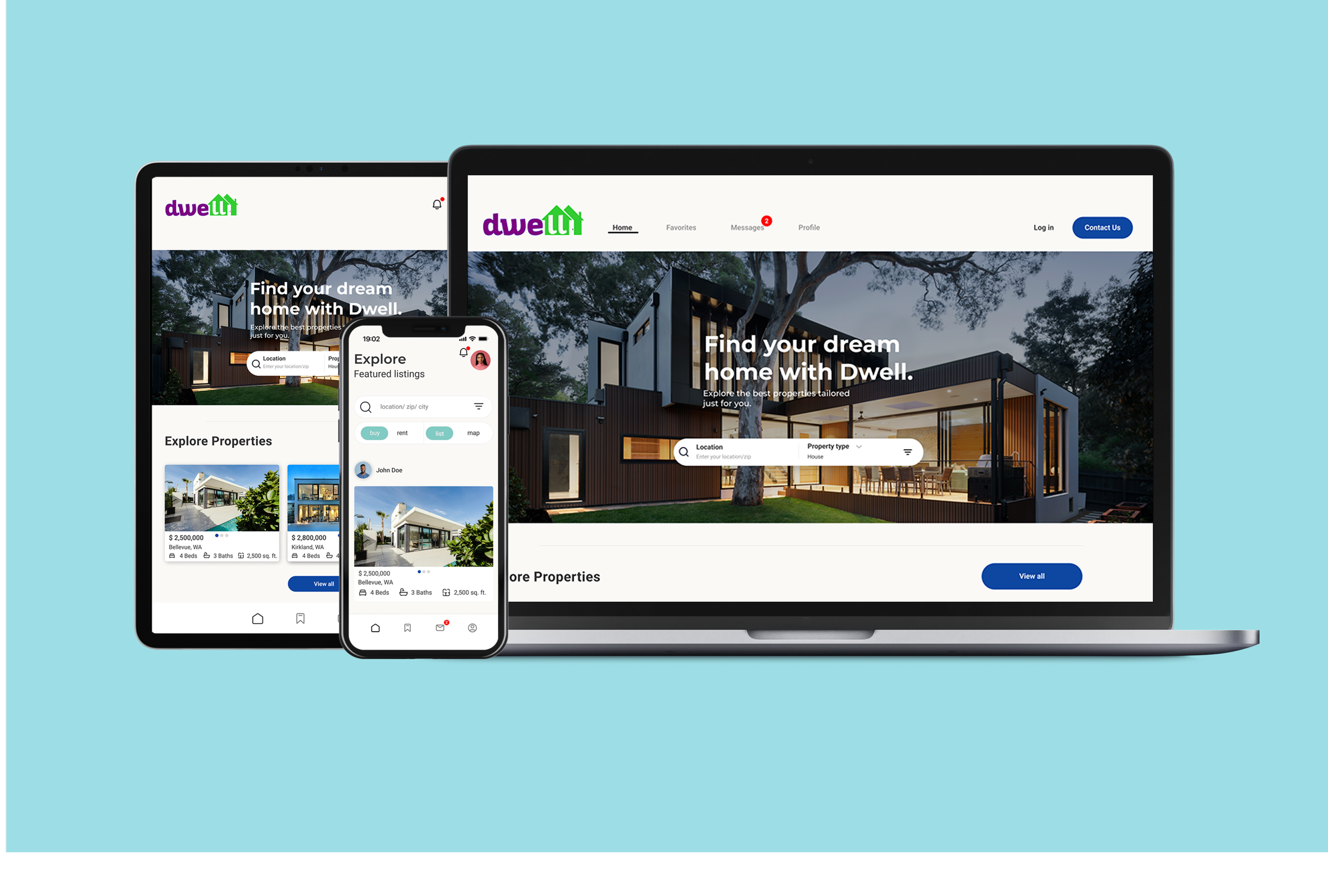
Tablet Homepage Hi-Fi

Desktop Homepage Hi-Fi

Tablet Search Hi-Fi

Desktop Search Hi-Fi
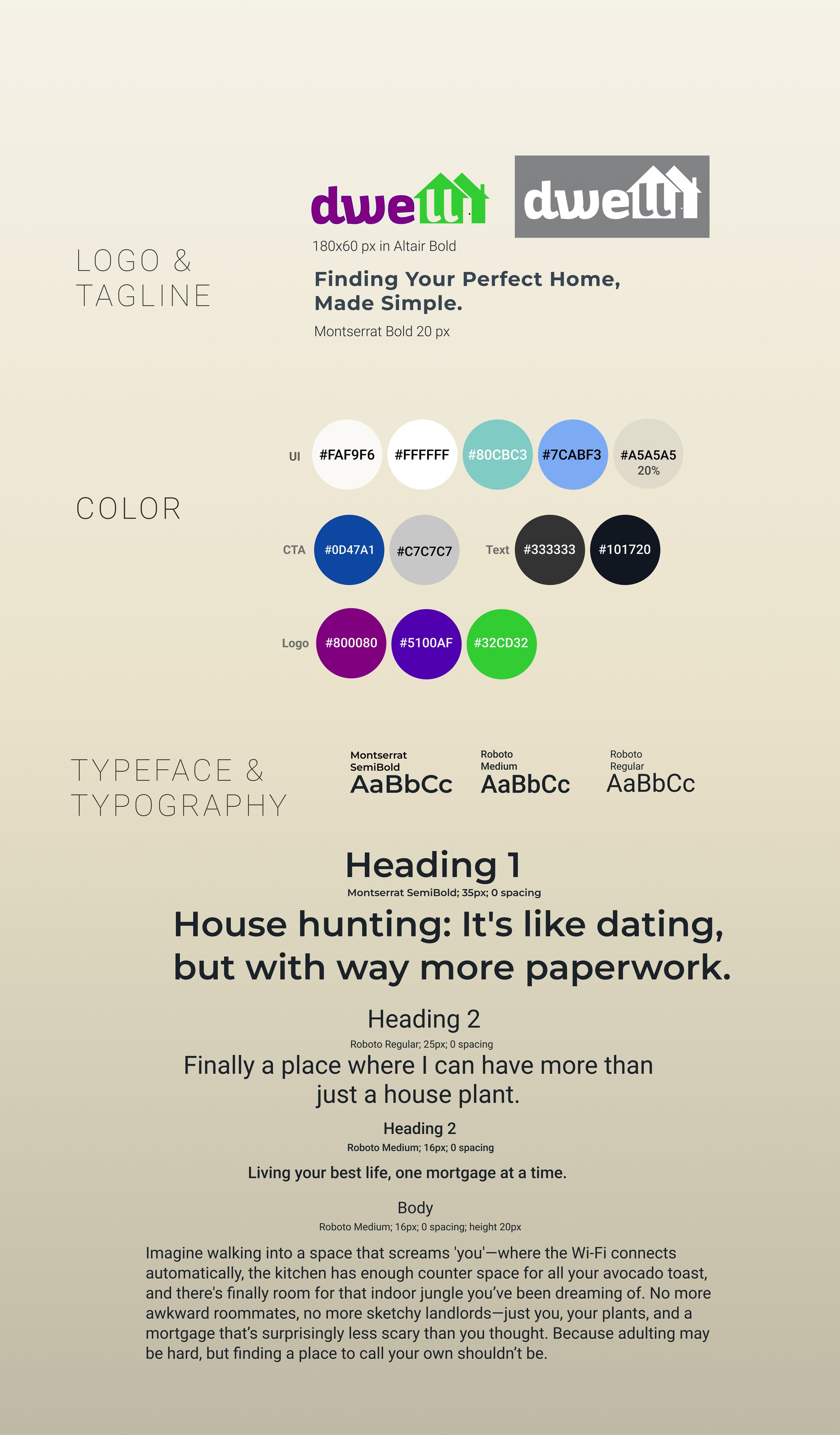
Style Guide
Mockups

I focused on a clean and straightforward design to enhance usability. After experimenting with various color palettes, I settled on off-white, blue and light teal. This minimalist approach created a cohesive and professional look, allowing users to navigate effortlessly and keep the focus on the content. The clean palette simplifies the interface and emphasizes key features, aligning with my goal of providing a user-friendly experience.


What I Have Learned…
Designing the Dwell UI taught me valuable lessons about creating a functional, responsive, and accessible user experience. Throughout the project, I encountered several challenges that helped me refine my design approach, particularly in the following areas:
Balancing Aesthetics and Functionality: Learned how to create a visually appealing design without sacrificing ease of use or intuitive navigation.
Responsive Design: Gained experience ensuring the UI remains consistent and functional across mobile, tablet, and desktop devices.
Accessibility: Developed a better understanding of accessibility needs, such as contrast, readability, and easy navigation for all users.
Performance Optimization: Focused on optimizing UI elements like images and animations for smoother performance and faster load times.